Wind Newspaper
Client Project
Media Website Design
2024
Role
UX Designer
Platform
Web, Mobile
Tools
Figma
Duration
4 weeks
Deliverable
Hi-Fidelity Mockups
The Challenge
Help readers find articles they're looking for as quickly as possible
Collaborators
James Rayo (me), Ernest Man (Developer)
Objectives
The business goal is to decrease abandonment and increase user retention.
What I did
I performed competitive analysis and framed problem points as a question to better understand pain points from a Wind Newspaper reader's perspective.
How?
I relied on research insights from competitive analysis to see what is working and what can be tailored to the specific needs of the Wind Newspaper reader audience.
Design Artifacts
Competitive Research
Information Architecture
Usability Test
Mid-Fi Wireframes
Mid-Fi Prototype
Hi-Fi Wireframes
Design Process
Research
Competitive Analysis
I took a look at the leading newspaper websites (San Francisco Chronicle and New York Times) to see strengths and weaknesses of popular newspaper platforms.
Positioning
Leaders on news in the U.S.
Audience
Local San Francisco Bay Area and United States
Strength
A lot of content and updated frequently
Weakness
There is so much information, newcomers may have trouble finding articles they are interested in and may cause users to miss articles they could have potential interest in.
Opportunities
Information structure can be similar but scaled down, and Wind Newspaper has the benefit of not having too much content.
Threats
Cannot compare Wind Newspaper with leading newspapers too closely, they are very different in terms of audience, audience size, and content (Wind only has so many writers). Therefore, Wind Newspaper will have to adjust their needs according to their users.
Original Website Audit
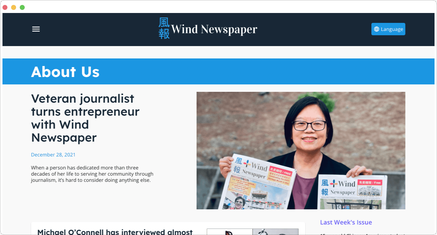
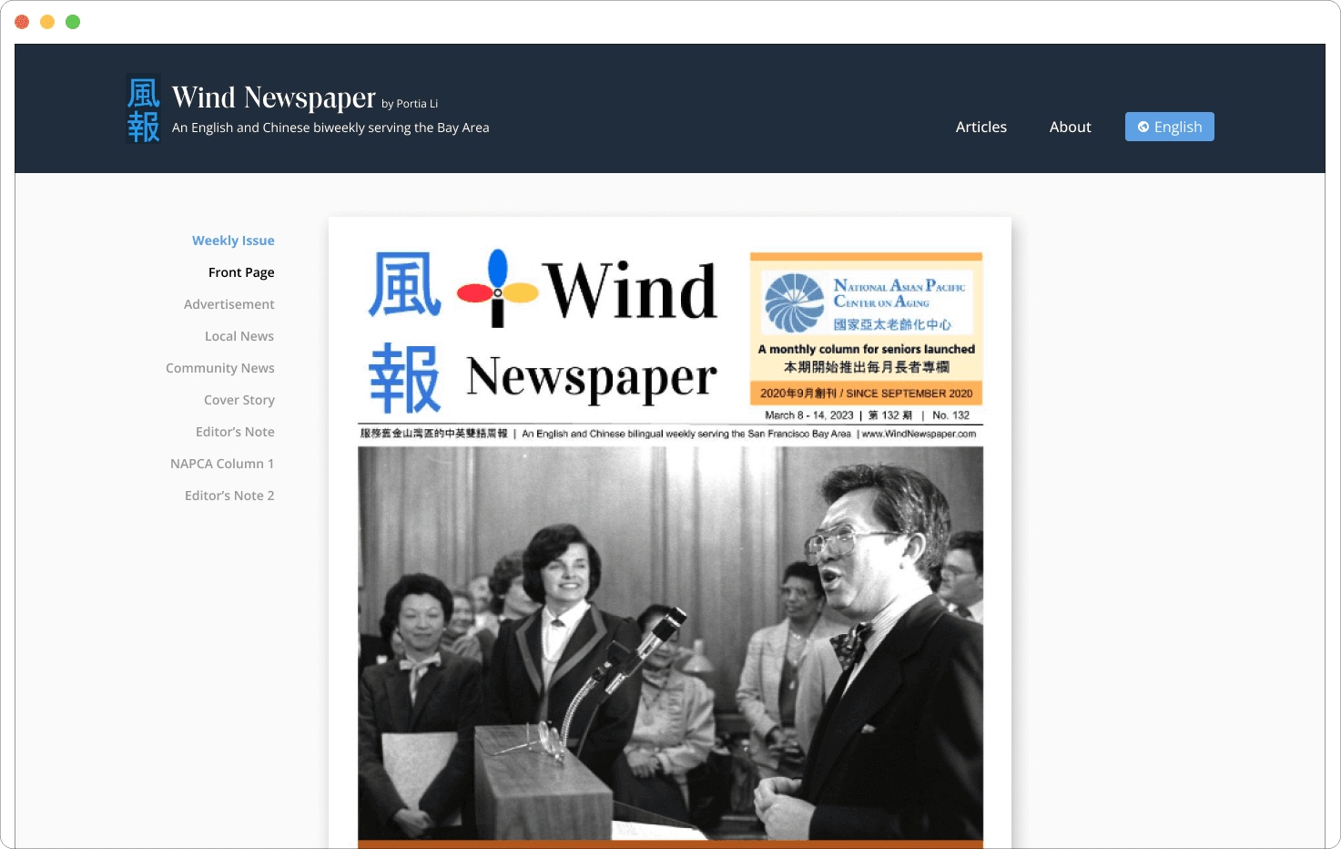
Home page
Does not give users full understanding of the entirety of the website's contents.
Menu
Can be condensed to have clearer user paths and have more site map visibility.
Weekly Issue
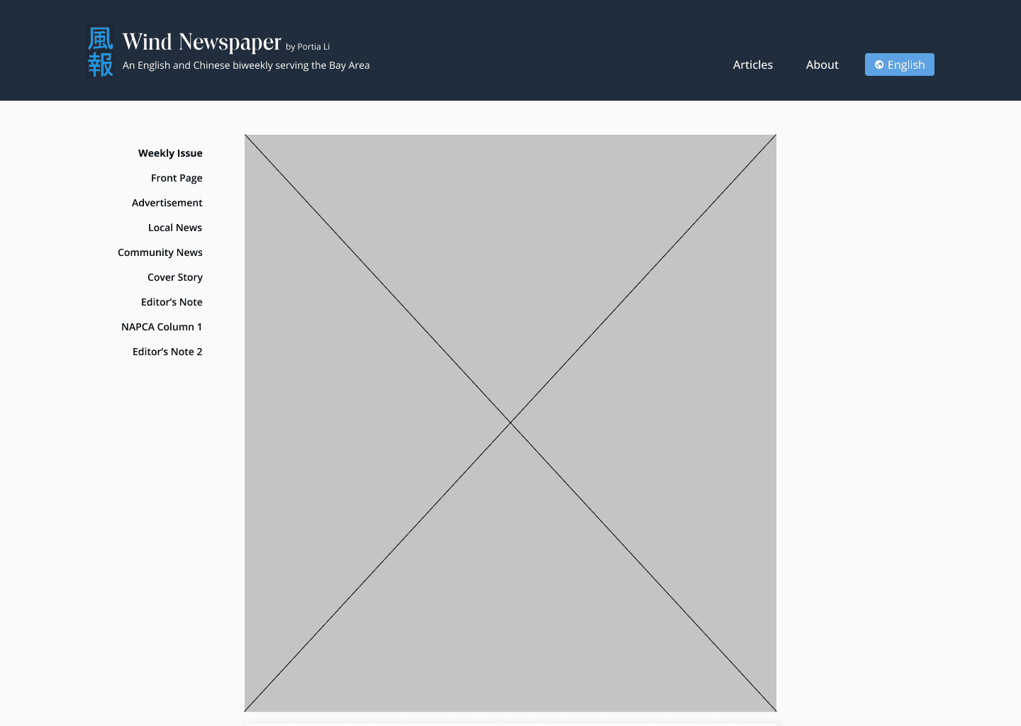
Physical copy view is not optimized the best way to view a physical copy.
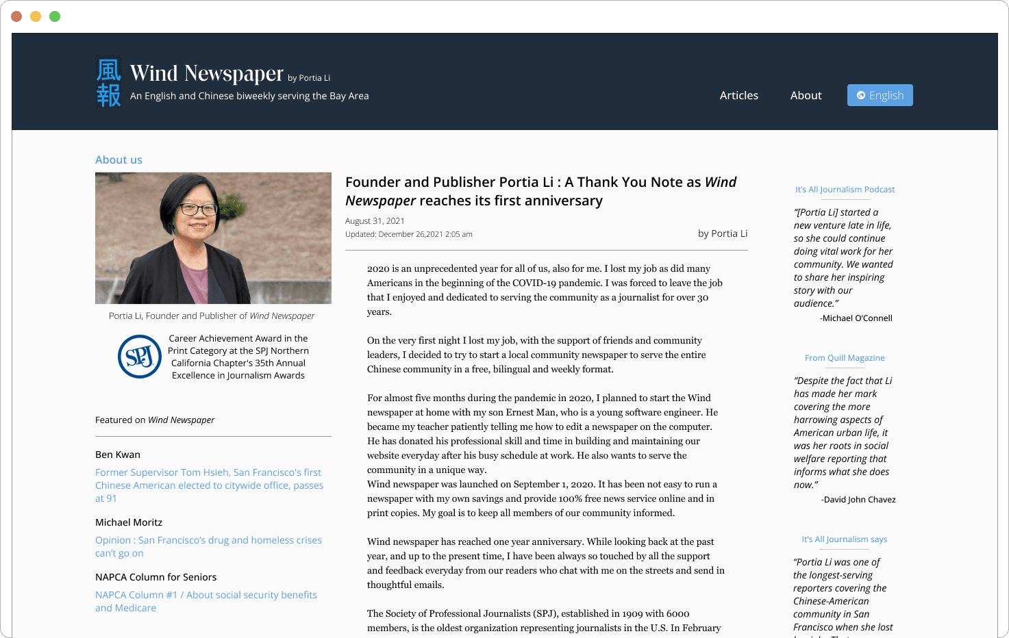
About Page
Unclear user location and should clarify what users viewing.
Evaluation
The primary design is structurally sound, the placement of older articles and articles in general can be cleaned up to clarify user mind mapping.
How might we make it easier for users to find the most interesting articles?
To answer this, I began to sketch out my ideas to get my creative juices flowing.
Crazy Eights
I attempted to keep a familiarity of how a physical newspaper is typically structured.
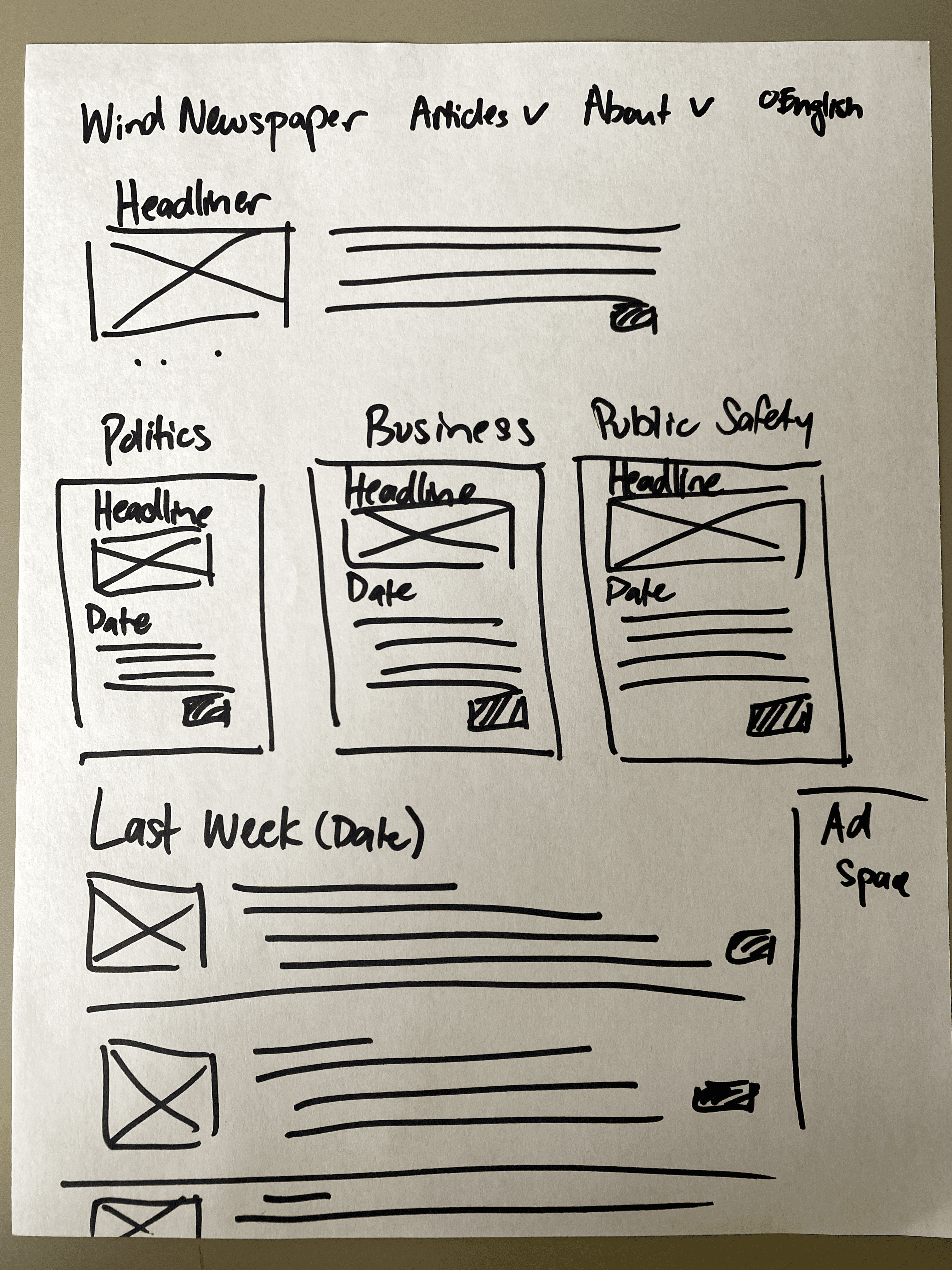
Final Wire Sketch
I decided on contained a headliner and highlighted particular categories while pushing older articles to the bottom.
I made sure to include dates for each article so they could figure out they were navigating the home page chronologically.
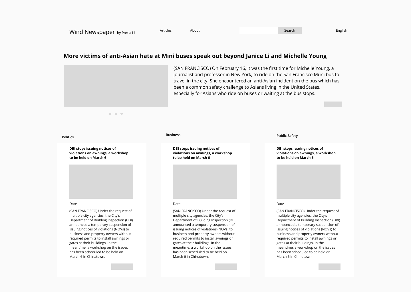
Low-Fidelity Wireframes
There was more text than what I would have wanted for the preview. But in the future, I believe they can be shortened and hierarchy can be improved.
Why would a user visit the "About" page?
To find out who they are, what their credentials are, and why they write.
So I created a profile page that included quotes from other articles as seen in the original
Why would a user want the PDF version of a newspaper when they're already online?
They would most likely prefer to look at a physical copy, so I included a scroll-to function to enhance usability for these users.
Iteration
Final Hi-Fidelity Wireframes
The high-fidelity wireframes were exhibited to the stakeholders and consulted during revisions leading up to the completed designs.
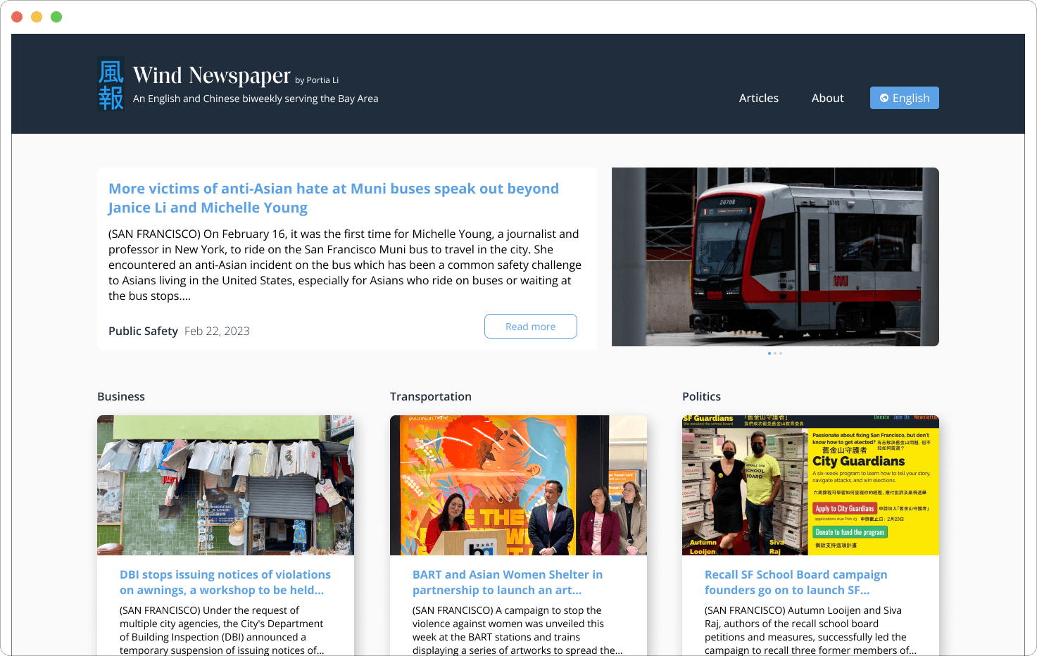
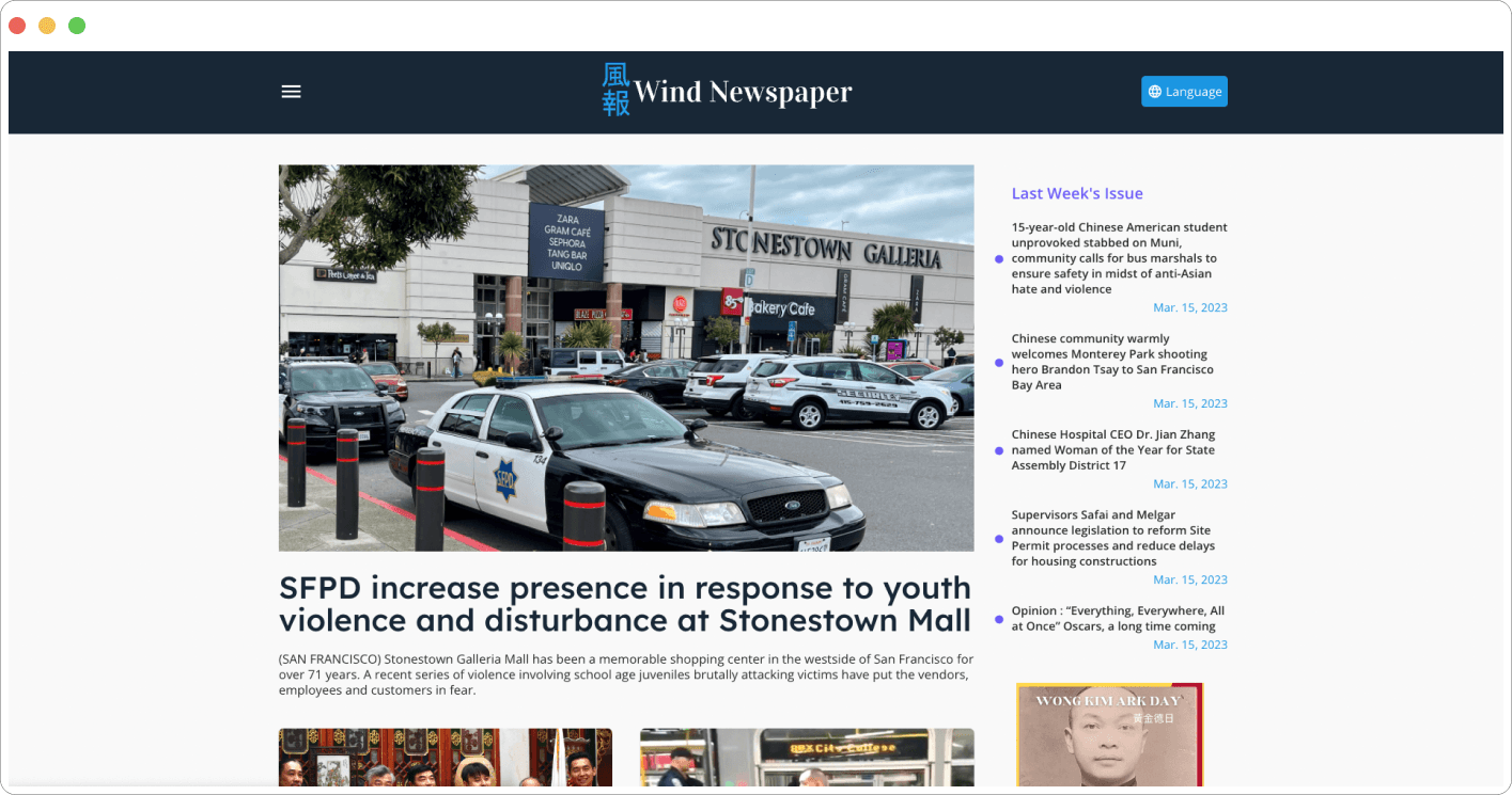
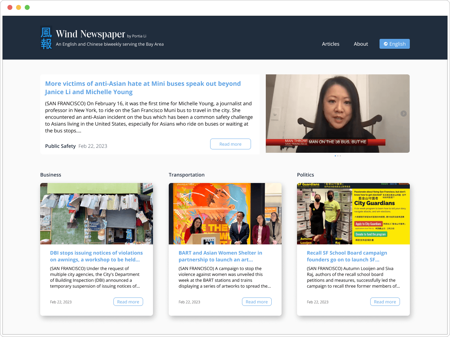
Home Page
The stakeholders wanted to keep the home page simple and modern, so I retained a similar hierarchy and added a date and call to action to the cards for each article.
Before
After
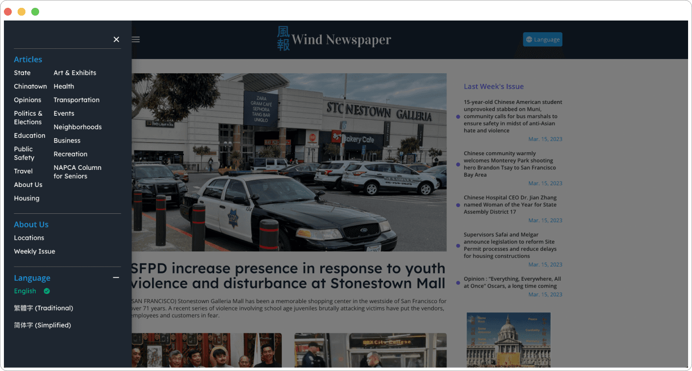
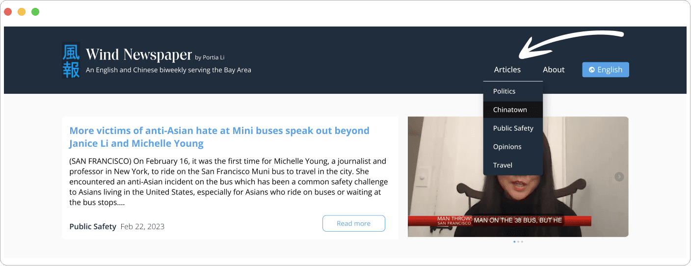
Menu
There were many article categories, but no every one of them had a new article as often as others, so I thought to consolidate some of the categories for users to simplify their decision choices and to keep each category page fresh.
Before
After
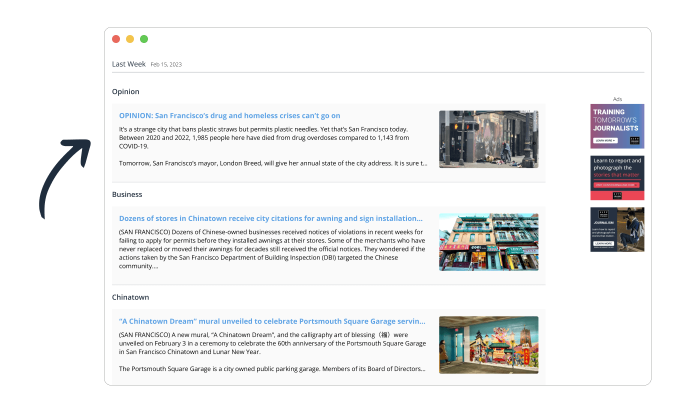
Older Articles
In the original, older articles were displayed on the righthand side of the landing page, however I thought that this space could be used for more relevant information or articles, so I pushed them further down and labeled them as such and included the ad space.
Before
After
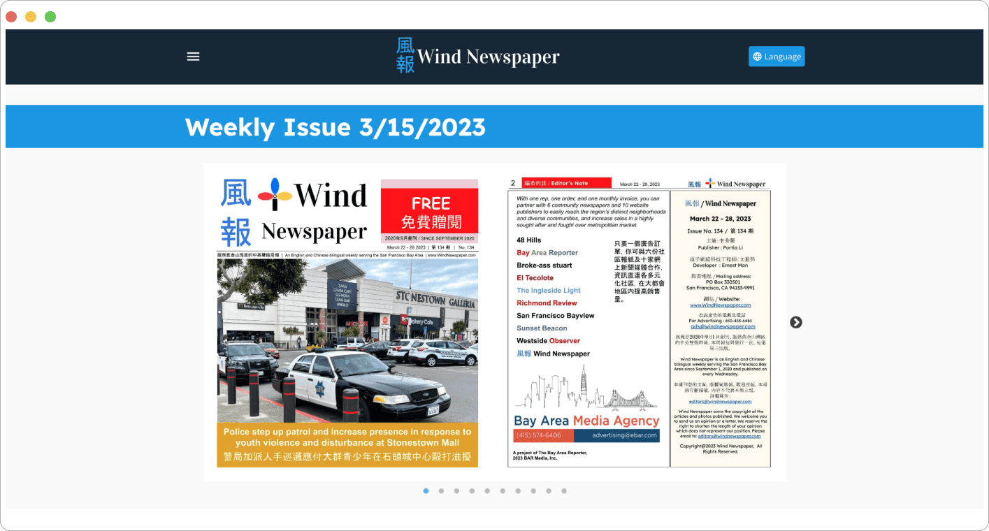
PDF Version
The carousel in the original did not seem efficient to me for users so I gave it scrollability instead and added some feedback and affordance, to let users know that the page has a scroll-to component.
Before
After
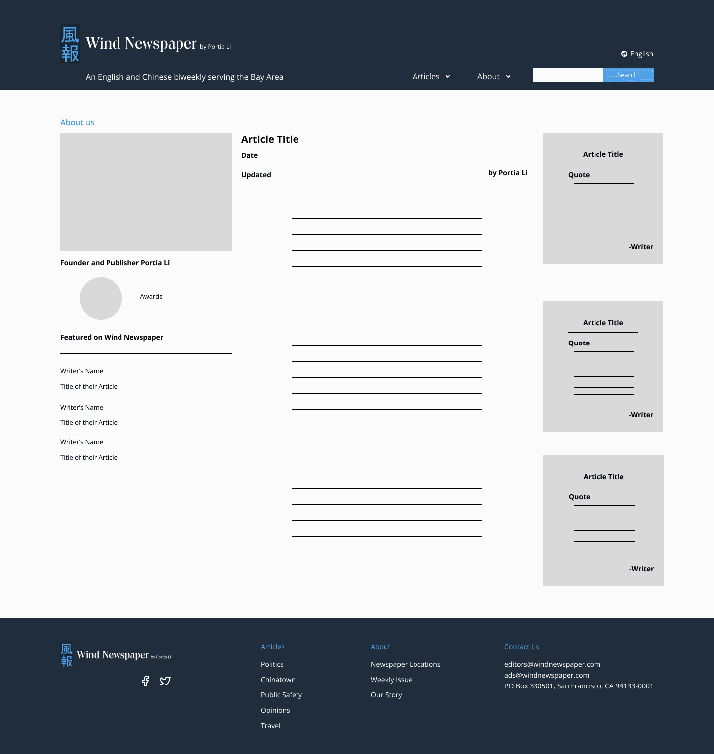
About Page
The About Page was originally a collection of articles featuring Wind Newspaper. One of those articles was written by the editor, so I set her article as the featured article. I gave her a small biography on the left hand side. There are a few featured writers in Wind Newspaper, so I included a featured writer section and links to their articles in the about page. I also wanted to keep the articles that Wind Newspaper was featured in so I took some notable quotes from each and linked them on the right hand side.
Before
After
What Next?
Outcome and User Metrics
60% more of users said they would continue to use Wind Newspaper. Both stakeholders were satisfied with the final prototype.
Next Steps
I would like to do a survey on physical copies vs. online version to see user's preferences for either as well as collect data for the physical copies distributed and compare it to the number of visitors online. Additionally, I would like to work with the stakeholders to give guest writers more credibility and visibility to the users.
Reflection: Framing Empathy as a Question
Since this project did not require a deep dive into defining the problem, I constantly asked myself questions as to the the purpose of each feature and thought about best way to further the main goals of each page.
After coming up with the underlying problems of the website, I used these problem questions to narrow down and pin point pain points.
Thanks for listening!
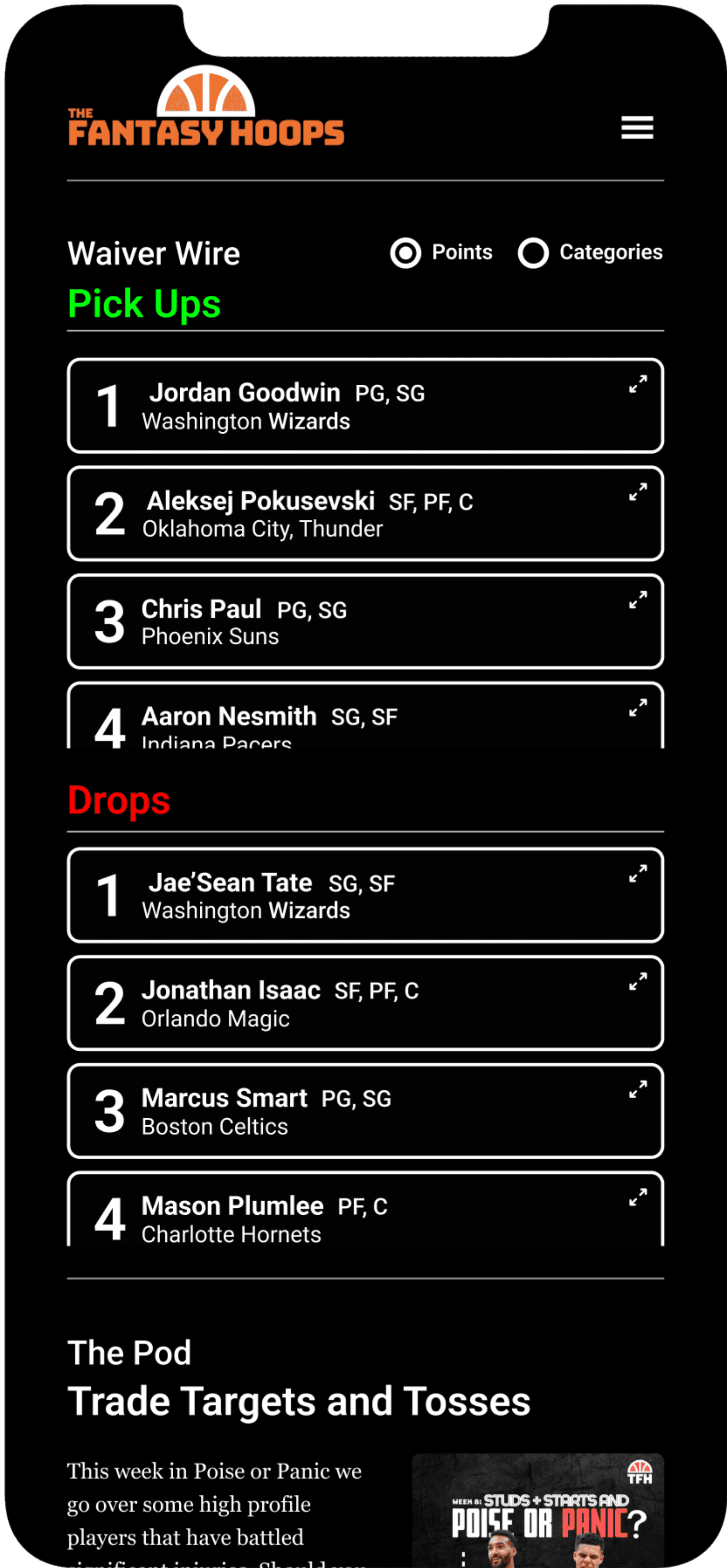
Pick Ups
Waiver Wire
Trade Targets and Tosses
The Pod
The Blog
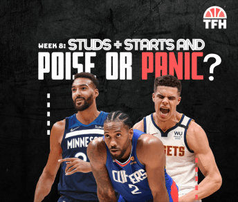
This week in Poise or Panic we go over some high profile players that have battled significant injuries. Should you find a trade partner for these players? Or should you show some poise and be patient? We tell you how to proceed if one of these guys are on your squad below!
NBA Week 8: Studs and Starts and Poise or Panic?
The Fantasy Hoops Podcast
Week 5 Starts and Sits
2 min read
Rain De Leon
Nov 15
The first month of the NBA regular season is behind us and superstars like Steph Curry and Joel Embiid dominated in week 4 with both having multiple 40+ games.
Players like Ben Simmons continue to struggle especially offensively and the Spurs have 5 games this week so someone like Charles Bassey should be rostered.
With the excitement of week 4 in the rear view mirror let’s look ahead to our Starts and Sits for week 5.
Read More
1
Jordan Goodwin
PG, SG
Washington Wizards
2
Aleksej Pokusevski
SF, PF, C
Oklahoma City, Thunder
3
Chris Paul
PG, SG
Phoenix Suns
4
Aaron Nesmith
SG, SF
Indiana Pacers
5
Reggie Bullock
SG, SF
Dallas Mavericks
6
Naji Marshall
SG, SF
New Orleans Pelicans
7
Gary Harris
SG, SF
Orlando Magic
8
Saddiq Bey
SF, PF
Detroit Pistons
9
Cole Anthony
SG, SF
Orlando Magic
10
Dennis Schroeder
SG, SF
Los Angeles Lakers
Drops
1
Jae’Sean Tate
SG, SF
Washington Wizards
2
Jonathan Isaac
SF, PF, C
Orlando Magic
3
Marcus Smart
PG, SG
Boston Celtics
4
Mason Plumlee
PF, C
Charlotte Hornets
5
Jalen Williams
SG, SF
Oklahoma City Thunder
6
Jabari Smith Jr.
SF, PF
Houston Rockets
7
Victor Oladipo
SG, SF
Indiana Pacers
8
Lebron James
SF, PF
Los Angeles Lakers
9
Derrick Rose
PG
New York Knicks
10
Jaden Ivey
PG, SG, SF
Detroit Pistons
Points
Categories
Copyright The Fantasy Hoops 2023. Terms and Conditions Privacy Policy
These statements are opinions from the Fantasy Hoops Podcast.
Do Not Sell My Personal Information
AdChoices
Waiver Wire
Pick Ups
Drops
Blog
Podcast
Content
Contact Us
Podcasters
About
Home
Tips
Pod
Blog
Contact
The podcast for your inside scoop to fantasy hoops
