The Challenge
Simplifying comprehensive real estate information
Collaborators
Kim Sidhu (Designer), Elliot Beak (Designer)
Objectives
Revise the layout and design of the property report to be more inclusive of visualizations in order to make reports more readable to users.
Revise the layout for how filters are organized when a query is made to Camphor Search.
What I did
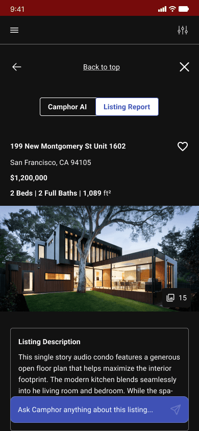
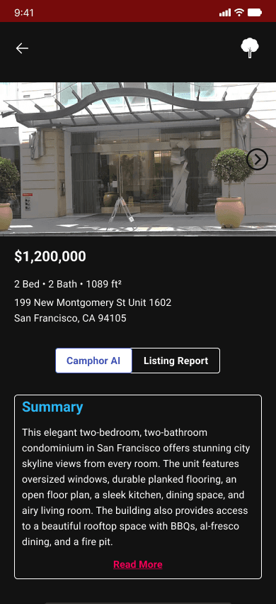
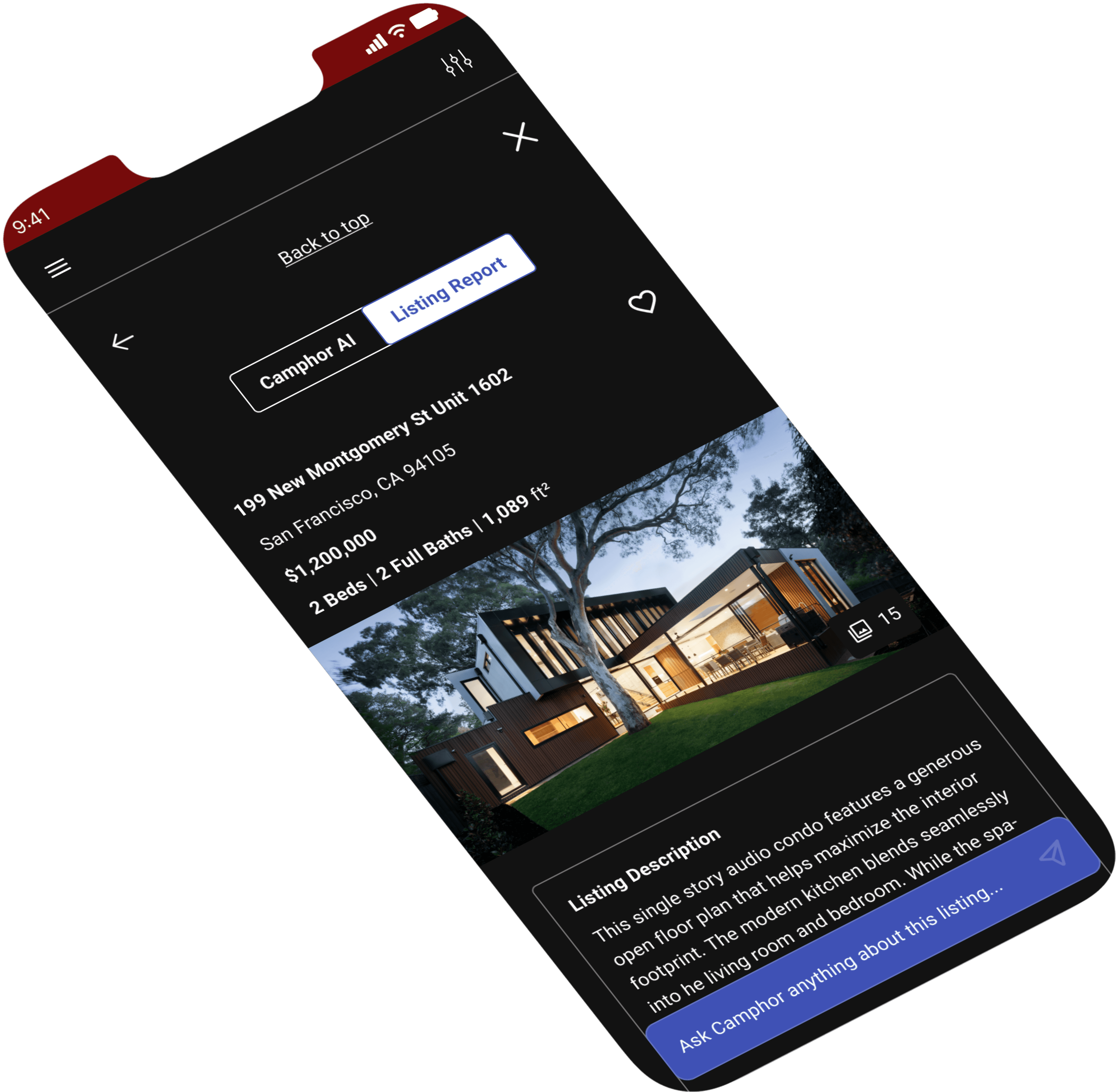
Designed the listing report page to make reports more readable for users and encouraged future iteration.
How?
I relied on research insights from user interviews to guide UI decisions and content hierarchy with the constraints of a start up company.
Bad News First
What went wrong?
We ended up not having enough time to design for desktop, so we pivoted to focus on mobile iterations. We'd rather have a well-thought out mobile design than rushed mobile and desktop designs.
We assumed we would have enough time in our 3-week sprint to cover our third, optional objective to design ways upsell Camphor Pro throughout different steps in the user journey. We did not.
We would have needed more time to consider what Camphor Pro offers. how it plays into users' needs, and how to weave it into the user flow.
There was so much data to work with from the jump, so we focused on:
communicating what Camphor can offer first time users
creating a clear, distinct path to Camphor's primary call-to-action (contacting an agent)
digestibility of data
Good News
What went well?
We did a poor job of managing scope, but now we know how we should budget our time next time. Under promise, over deliver.
Did I improve as a designer?
Yes, I learned what to prioritize for users in the time given, so that both users and business feel the most impact from the work I can do.
I've developed a new appreciation for setting up future plans to create a cohesive trajectory that aligns with business needs and goals.
For next time
We did our own research to cross reference with our client's research. This was our first mistake. We were too wrapped up in what we've learned from our course, we made the assumption we should be following a strict design process each new project.
What we should have done is rely on our client's existing research and with that extra time, we could have completed more of our objectives.

Our Users
"The Casual Homebuyer"
People in the market to purchase a home to live in, whether it's their first home, an upgrade, downsizing, or a relocation.
They not be actively involved in real estate transactions on a regular basis and might not have a deep understanding of the complexities of the housing market. They often approach the home-buying process with a more informal mindset compared to professionals who engage in real estate transactions as a business.
User Interviews
What did they have to say?
“I found sellers did not disclose information on their property, this is a huge problem…[I had to] discover this through my own research.”
“Purchasing property is a little scary because there’s a lot to consider since it’s my first time.”
Who did we interview?
So we interviewed 9 potential users who have bought a home or are looking to buy a home. We unveiled both new and old key insights. Camphor had conducted their own research and although there was overlap in research results we were able to find new insights, reinforce old ones, and develop real empathy for user pain points.
So who did we design for?
These personas emerged from our research data to guide our design decisions.
Alex, The Anxious Buyer
"Purchasing property is a little scary because there's a lot to consider since it's my first time."
Goals
Paint Points
Sarah, The Mindful Buyer
"I want to see more information about the history of the house"
Goals
Needs
Paint Points
Key Findings
Our Goal
Because buying a home is so costly nowadays, finding a home that matches your needs can be daunting. The search can create uncertainty. People want to know how their next home will fit into their work life, fit for their family, and if they will be safe. Home buying is a personal experience.
Our ambition was to create a strong foundation to give homebuyers, like Alex and Sarah, confidence when exploring potential dream homes.
Objectives
How did these insights fit into our scope?
Our task as a team was to:
Revise the layout and design of the property report to be more inclusive of visualizations in order to make reports more readable to users.
Revising the layout for how filters are organized when a query is made to Camphor Search.
Mobile First
We wanted to design mobile-first in this case because there was SO much information to present to the user. We wanted to make sure we prioritized the correct information in the mobile designs and follow suit in the desktop iterations.
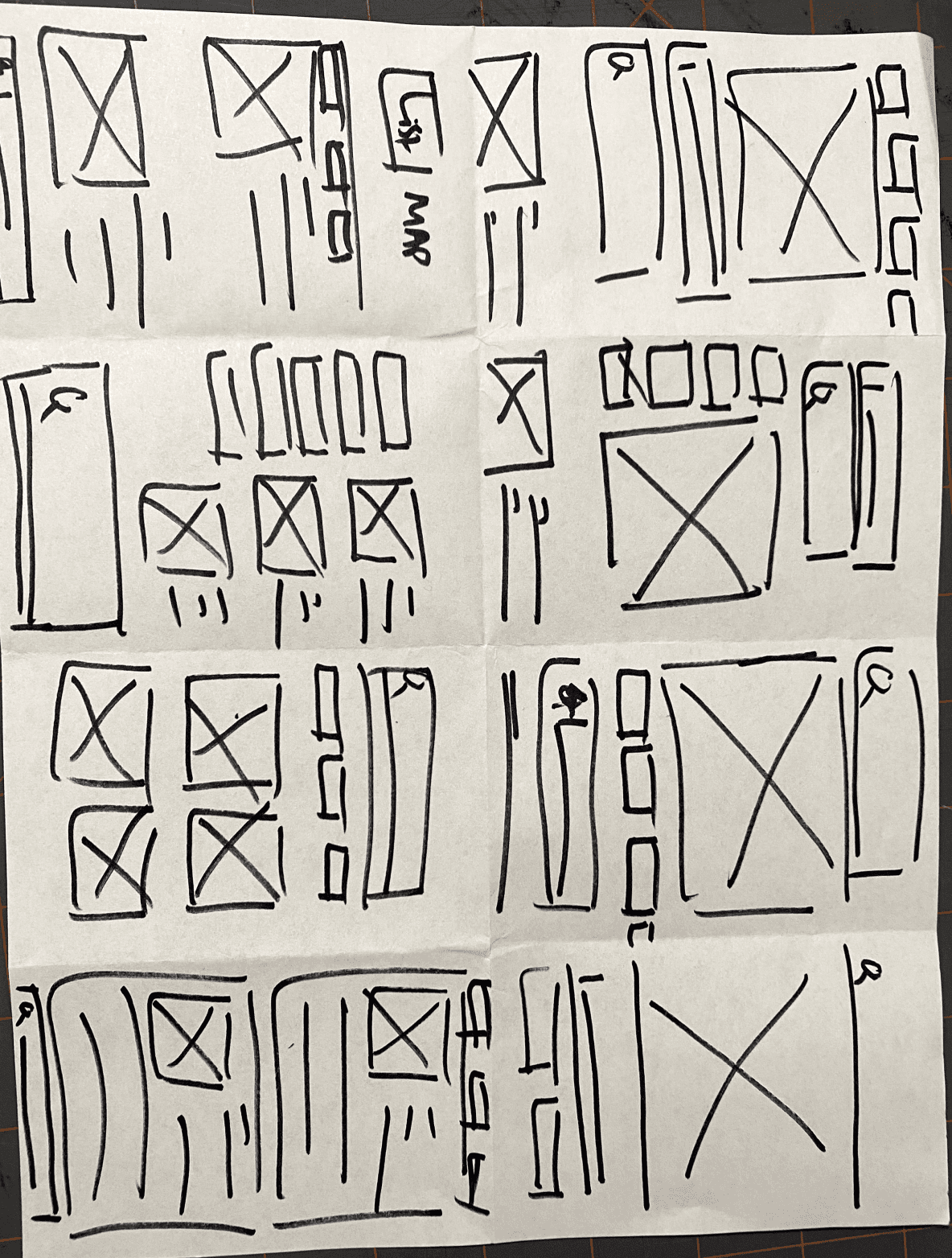
Sketching
Each member of the team sketched ideas on our own. We later came together, took parts we liked, and combined them into a quick wireframe sketch to propose to our stake holders for feedback.
Crazy 8s
We had a bunch of ideas, but given the time constraints and scope, we decided on the biggest pain point for users and focused on feasibility.
Although the ideas we portrayed to the stakeholders were clear, there was still some disconnect in how our design team and stakeholders saw the objectives being completed: We were dreaming big and good but just not currently feasible. So we narrowed down within our feasibility constraints.
Task Flow
Although there was already an existing task flow, we outlined our own to see if we needed to add/remove screens. Our task flow differed from
Mid-Fidelity Wireframes
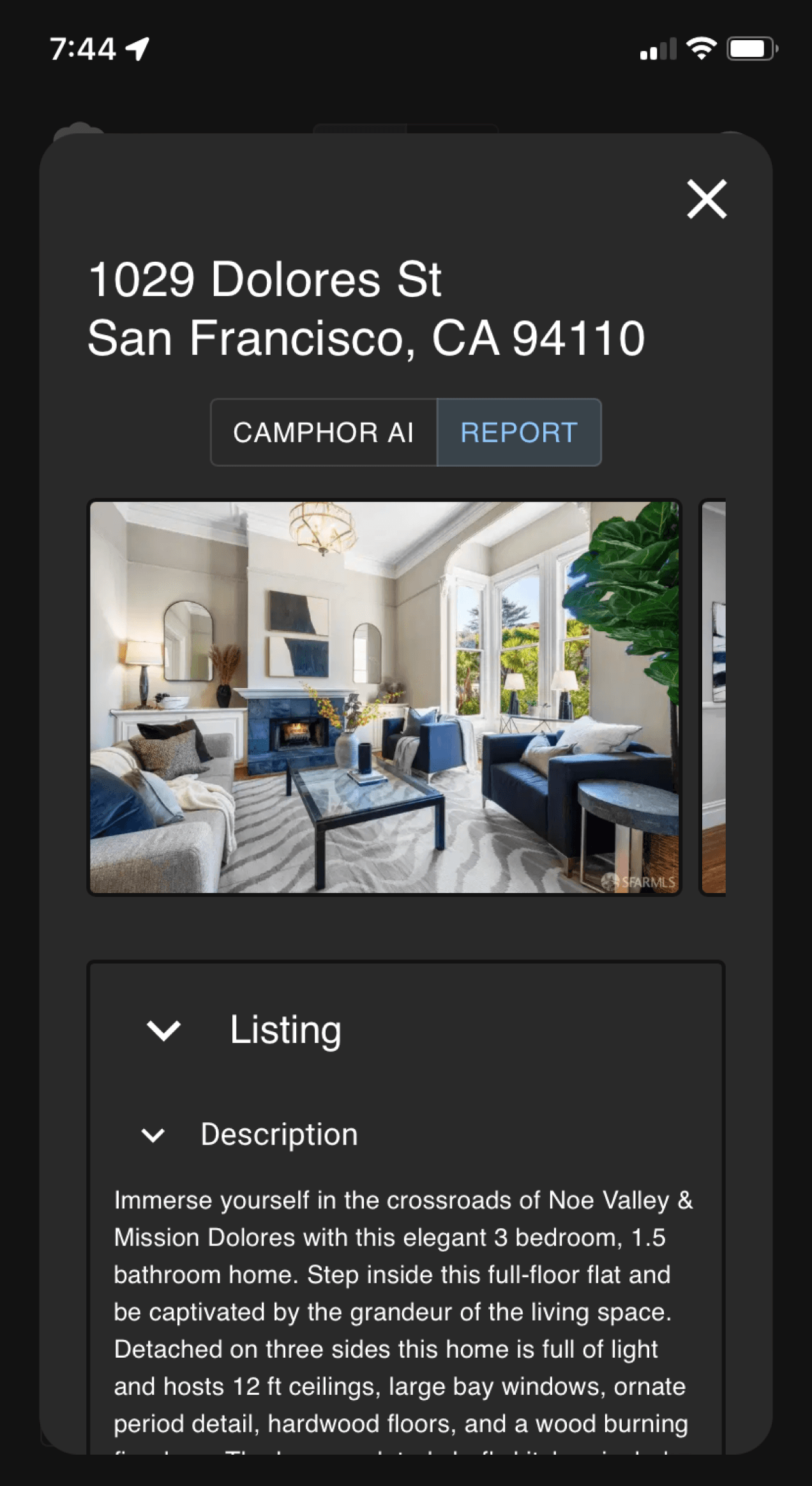
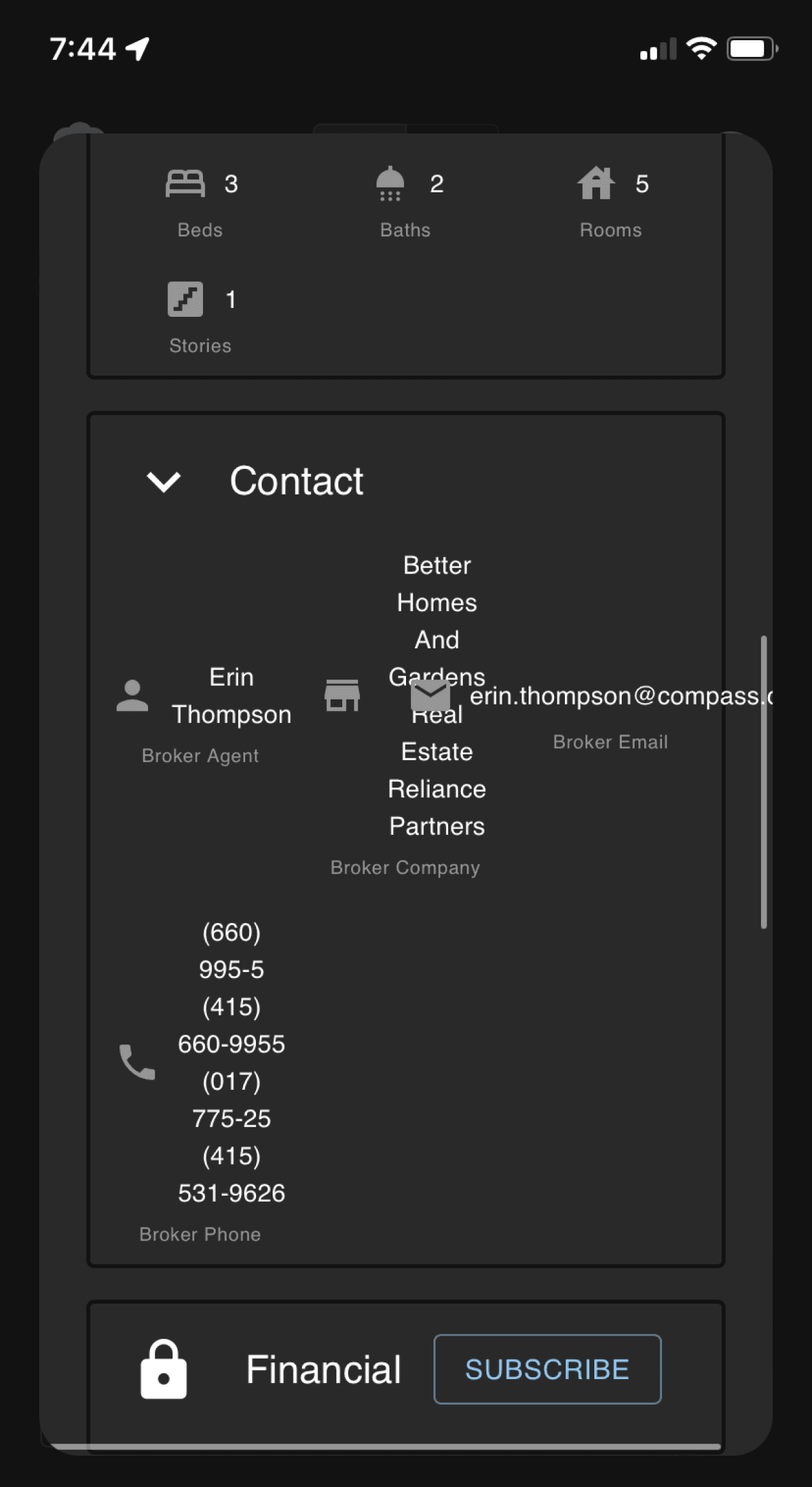
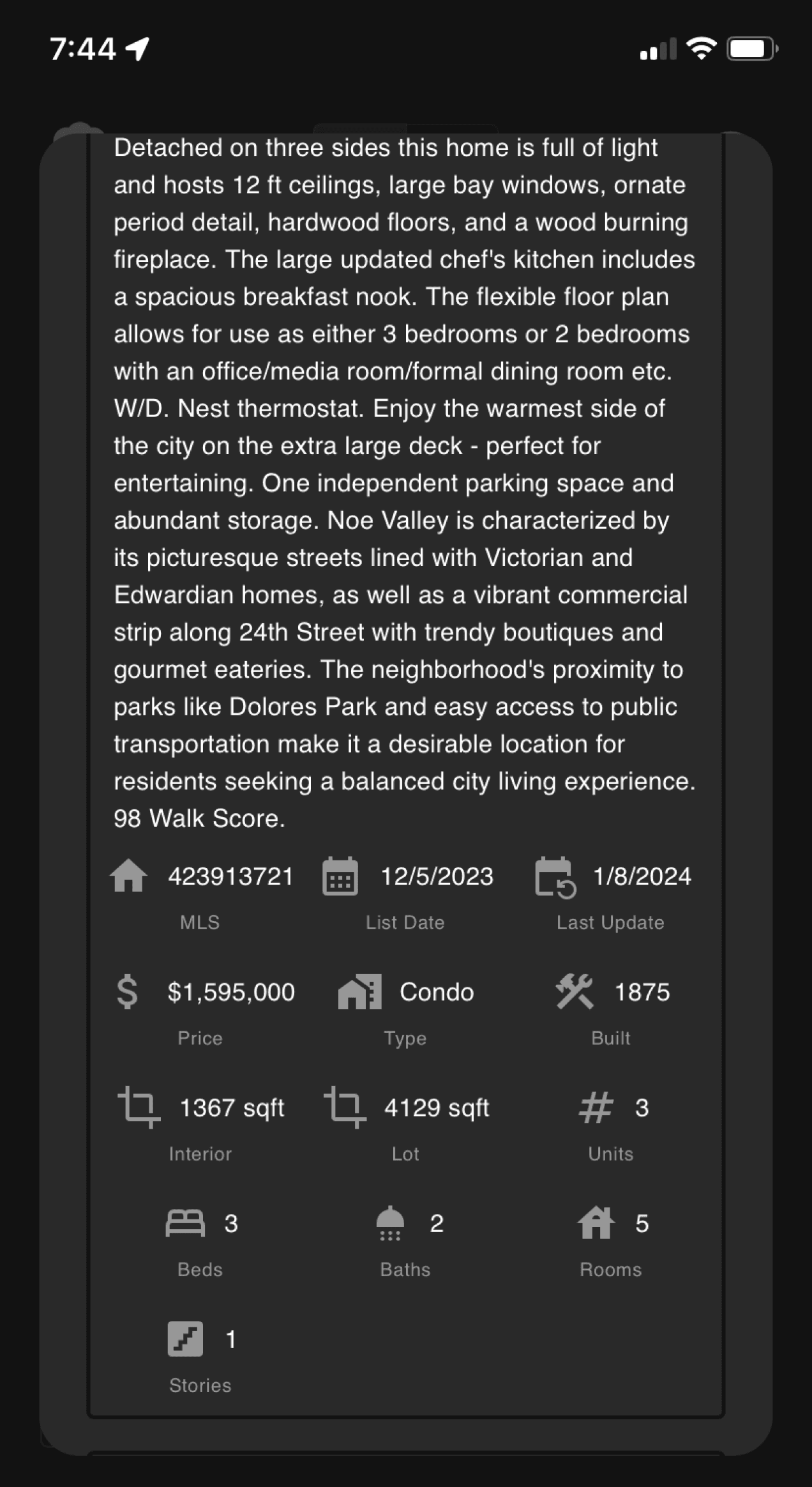
The original designs for the report page were dense, difficult to read, complicated and wasn’t readable/digestible. As an AI product, we would like to encourage users to interact with the AI more by adhering to user friendly guidelines.
Screenshots of the original design
Design Decisions
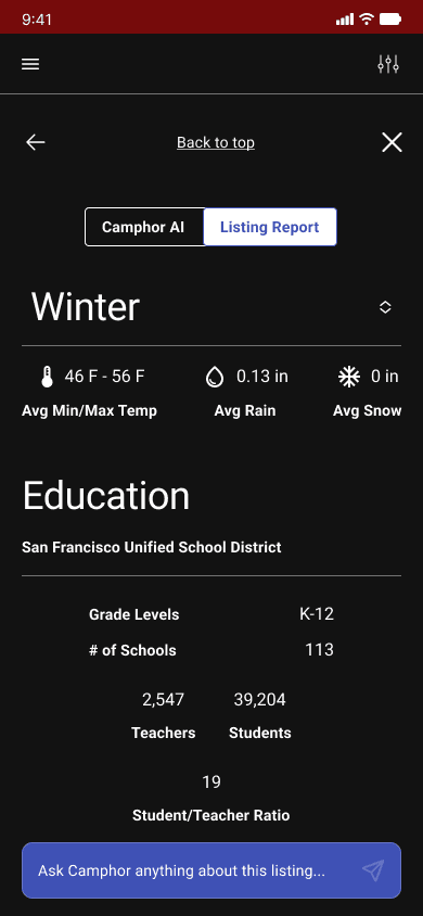
I organized the report listing page by to bringing important information to the top.
In the original design, the data associated with each other was stacked and center aligned, making it difficult to read. So I designed it to be readable from left-to-right
Our mid-fidelity wireframe iterations
Sectioning
Lists were used to section off relative information because unrelated items were often seen close too each other.
Condense
Particular information was condensed to allow users to choose what they see and allow them to fall back on the AI tool to search within the report.
Left-Align
To maintain readability, we made everything left aligned as opposed to stacked, center-aligned groupings.
How would we know if our designs are user friendly?
We created a mid-fidelity prototype to showcase our ideas to stakeholders within the task flow and to usability test later on to make see what needs to be changed.
Hi-Fidelity Mockups
Reflecting on the Bad
What went wrong?
We ended up not having enough time to design for desktop, so we pivoted to focus on mobile iterations. We'd rather have a well-thought out mobile design than rushed mobile and desktop designs.
We assumed we would have enough time in our 3-week sprint to cover our third, optional objective to design ways upsell Camphor Pro throughout different steps in the user journey. We did not.
We would have needed more time to consider what Camphor Pro offers. how it plays into users' needs, and how to weave it into the user flow.
There was so much data to work with from the jump, so we focused on:
communicating what Camphor can offer first time users
creating a clear, distinct path to Camphor's primary call-to-action (contacting an agent)
digestibility of data
Reflecting on the Good
What went well?
We did a poor job of managing scope, but now we know how we should budget our time next time. Under promise, over deliver.
Did I improve as a designer?
Yes, I learned what to prioritize for users in the time given, so that both users and business feel the most impact from the work I can do.
I've developed a new appreciation for setting up future plans to create a cohesive trajectory that aligns with business needs and goals.
What would I do differently next time?
We did our own research to cross reference with our client's research. This was our first mistake. We were too wrapped up in what we've learned from our course, we made the assumption we should be following a strict design process each new project.
What we should have done is rely on our client's existing research and with that extra time, we could have completed more of our objectives.
Next Steps
Usability Testing
We would love to see usability testing to find out the time it takes to complete certain tasks with the new design.
Eye tracking tests would be useful to see where users are drawn to and track abandonment areas.
User Experience
We would also like to see Camphor’s user experience examined as a whole since AI is relatively new and it would be great to see what types of ways we can onboard first time users.
UX Writing and Interaction Design
Expanding Camphor’s interaction design would bring up questions of feasibility, however, the use of interaction and UX writing combined could exponentially increase user experience quality by making the experience significantly less daunting and unfamiliar.
Color and Branding
Since home buying can be a stressful and emotional, especially for the first-time homebuyer, that stress might be eased by developing Camphor's brand through use of color.
Thank you for listening!

