Food Rescue Robot
Design Bootcamp - Coursework Project
Mobile App Design
2023
The Challenge
Expediting the onboarding experience for volunteers to complete food-waste deliveries
Collaborators
James Rayo (me), Nolan Golden, Vania Liu, Philip Yoon
Objective
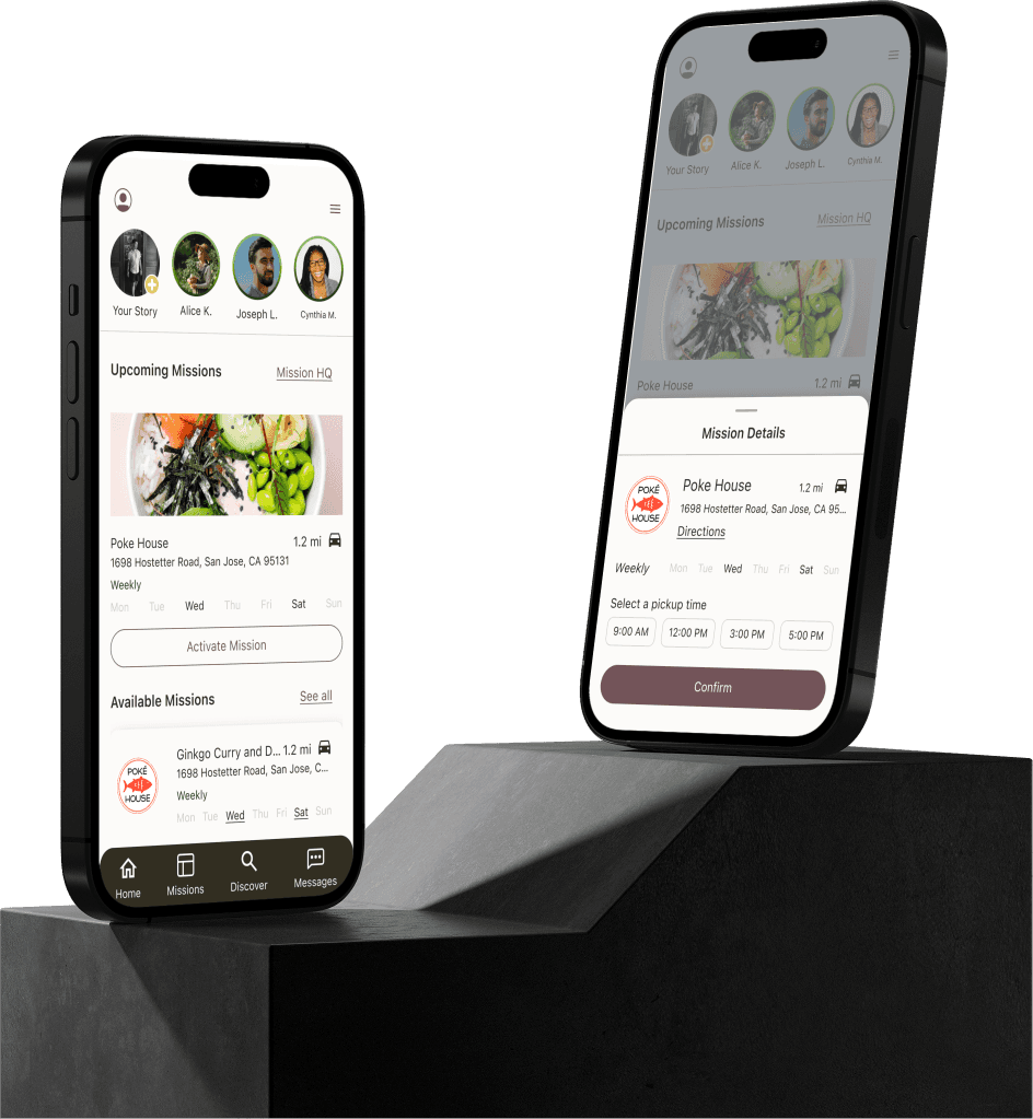
Package its existing data into a more accessible mobile app that makes it easier for people to volunteer, and for volunteers to optimize their efforts.
What I did
I spearheaded the creation of the hi-fidelity mockups to ensure fields are distinct and information is digestible.
How?
I relied on research insights from user interviews and competitive/comparative analysis to guide UI decisions and content hierarchy while maintaining branding guidelines.
Where did we start?
Initially, we immediately wanted to start on user research and make user interview questions directed towards people who were likely to use a volunteer app like Food Rescue Robot.
However, we began to realize our understanding of Food Rescue Robot was not on the same page. This prompted the thought: If we didn't have a solid understanding of what our product was, how could we even begin to understand the people who want to use it?
This prompted us to conduct foundational business analysis research to further our understanding of what Food Rescue Robot is and question the sustainability of biking as a mode of delivery in order to understand its users.
What even is a Food Rescue Robot?
Business Analysis
After a bit of background research, we found that Food Rescue Robot was unfortunately not actually robot. (If this is confusing to us, it will probably be confusing to users.)
We also became confident that Food Rescue Robot was essentially a food delivery app, but instead of coordinating the delivery of ordered food, they were coordinating the pick up and drop off of food waste.
User Research
Our Users
We needed to design for volunteers who were picking up and dropping off that food waste.
Equipped with our newfound understanding, we pivoted our research approach to design better user interview and survey questions.
User Interviews
We interviewed 8 humans who have volunteer experience or who are looking to volunteer.
We unveiled both new and old key insights. Camphor had conducted their own research and although there was overlap in research results we were able to find new insights, reinforce old ones, and develop real empathy for user pain points.
Research Insights
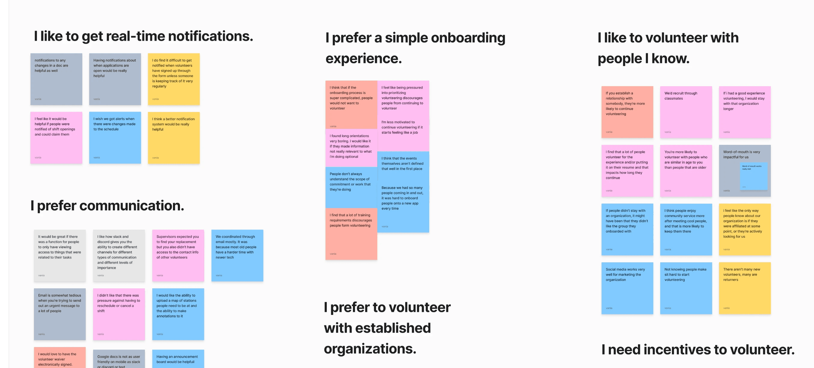
We began to synthesize via affinity map.
Key Takeaways
Our affinity map revealed pain points that users:
struggle with complicated onboarding experiences
didn’t like using multiple platforms for coordination and scheduling
value communication
So who did we design for?
Reflecting on the research data, we came up with the personas of Becky and Thomas who reflected a well defined user story that we found could be most common throughout our user experience.
Becky Goudhair, (she/they) 25 years old
Becky is a regular volunteer who wants to use her bicycle to rescue food sustainably. Becky needs to find & select rescue operations conducive to her biking lifestyle.
Needs
navigation that suggests missions suited for her mode of transportation
a simple and quick way to sign up for shifts as she’s about to go biking
Motivations
sense of community
sustainable living
Frustrations
food rescue missions are rarely bike-oriented
other platforms don’t notify me about opened rescue shifts for bicyclists
her platform's navigation is not catered towards her mode of transportation
Thomas Elliot, (he/him) 60 years old
Thomas is eager to find a fulfilling way to spend his free time. He's genuinely interested in volunteering but often doesn’t complete registration for volunteer activities due to the poorly organized and tedious nature of onboarding. Thomas needs a simplified application process that makes signing-up to volunteer accessible.
Needs
A simplified and informative onboarding experience
An easy to use app
Motivations
Wanting to do something with his free time, but doesn’t also want to feel like work
Enjoys connecting with other people in his age demographic
Frustrations
Struggles learning complicated technology
Less motivated to continue volunteering if it starts feeling like a job
Discouraging when an organization is too busy to properly onboard/teach
Found long orientations very boring
Thomas, our secondary persona, reflected someone doing a food rescue mission for the first time.
The Problem
Getting the volunteers' foot through the door is what is blocking them from volunteering
With our new personas we could now close in on the clearer problem that Food Rescue Robot volunteers might be facing. So we asked:
How might we give Becky a better way to find volunteer opportunities conducive to her biking lifestyle?
How might we give Thomas a simple, accessible sign-up process to set him up to complete food rescue delivery?
As we later designed for our personas, we found that Thomas actually had many more pressing pain points that needed to be addressed and so our personas went through a few iterations the more we understood our users.
How can we design the app to accommodate Becky and Thomas?
Becky's Task Flow
Becky’s task flow was straight forward, encapsulating the fundamental aspects of what food rescue robot does.
Thomas’ Task Flow
Thomas’ flow was a bit longer to include a fleshed out onboarding experience flow and assistance feature to eliminate confusion throughout the volunteer process.
Competitive and Comparative Analysis
We were unsure of where to begin in our sketches for our new personas, so we relied on our competitive and comparative research to help us ideate solutions.
Types of businesses analyzed:
Food rescue organizations
Food delivery services
Scheduling apps and services
Biking apps
Takeaways
Efficiency of sign-up/onboarding flow is important
Multiple shift options (frequency, times, locations)
Real-time communication needed
Safety concerns/verifications
Crazy 8s
With the competitive/comparative analysis fresh in our minds, we were inspired to do some crazy 8s.
These are some of the sketches I came up with.
Reassessment of Scope
We had a few options but the main concepts we liked from sketching that we wanted to work with and fit into our scope were:
have the app ask about vehicle choice and tailor their flow according to accommodate for delivery route and pickup size
announcements
list view
confirmation
vehicle toggle
gamification dashboard to give users intrinsic reward from volunteering (opportunities, achievements, and current deliveries (missions)
chat and assistance
list and map view of deliveries
MOSCOW
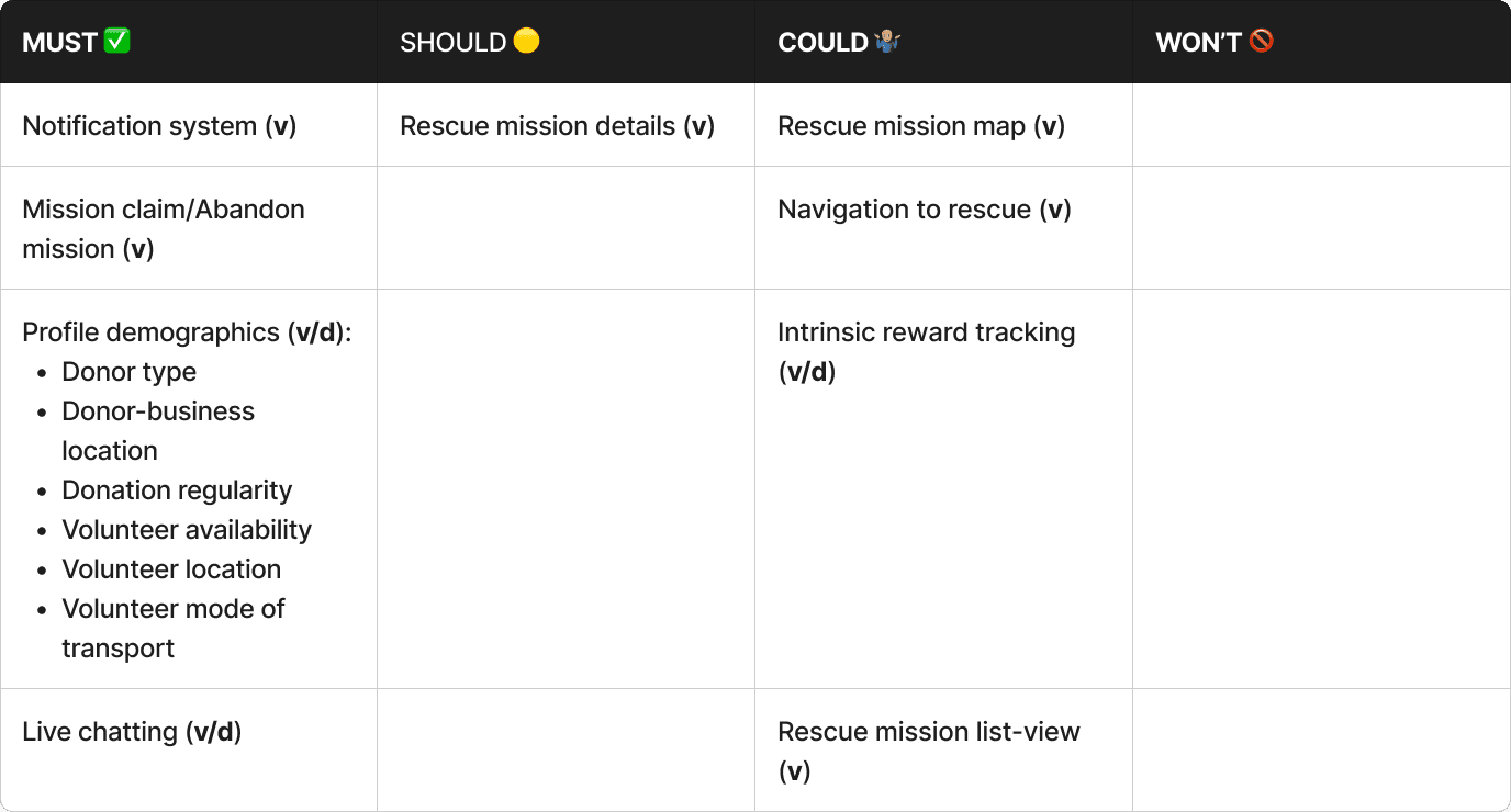
However, before we began to wire frame our sketches, we took our time constraint into account and used MSCW to decide which UI functions to prioritize.
Low-Fidelity Wireframes
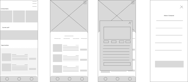
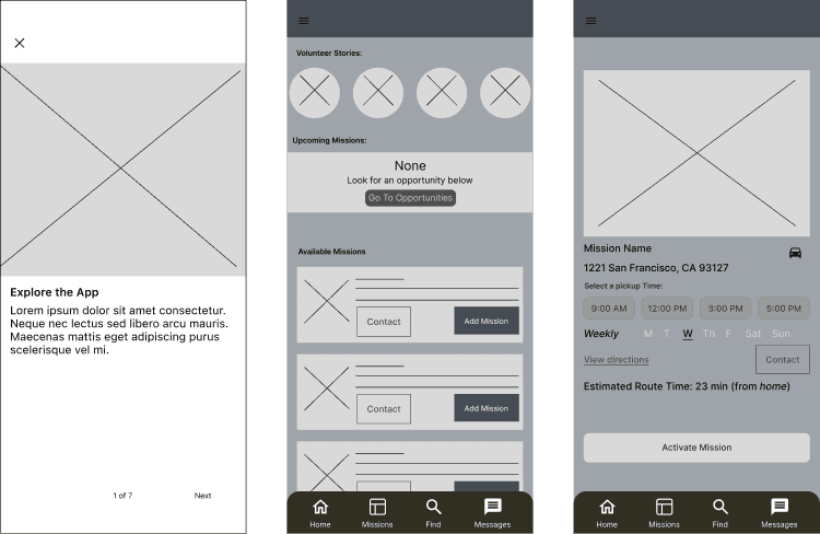
The low-fidelity wireframes really challenged our handle of the scope of this project. Because there were so many directions to go based on our research, going crazy with the features was a reoccurring problem for us.
I was able to remedy this during our collaboration sessions by asking ourselves questions about scope:
Is this feature going to be the most impactful for users based on the research we've done?
Do we have enough time to design out this idea while leaving room for feedback in case it doesn't work?
What does our research say?
Prototype and Usability Test
We conducted 2 usability tests with our prototype to find flow problems we could address in the high fidelity wireframes and found issues with:
UX writing
Flow end state
Hi-Fidelity Wireframes
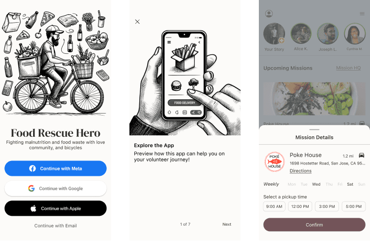
We ended up adding a lot more high-fidelity screens than we had low-fidelity. This was because there were some key research insights that we overlooked in our low-fidelity designs.
To prevent this next time, I think we should spend more time on task flows to make sure our low-fidelity wireframes follow them more closely and have some sort of checklist of research insights we need to cover.
Next Steps
Usability Test
We would like to do more usability testing to identify any issues along the onboarding process.
Gamification
Depending on feasibility constraints, I'd play around with UX writing to make the volunteer missions more engaging and rewarding.
Community-based
Based on our research, a lot of volunteers were motivated by a sense of community and friendship when volunteering. In future iterations, the social aspect of the app may need to be explored so that we might bring more joy in the relationships volunteers make along the way.
