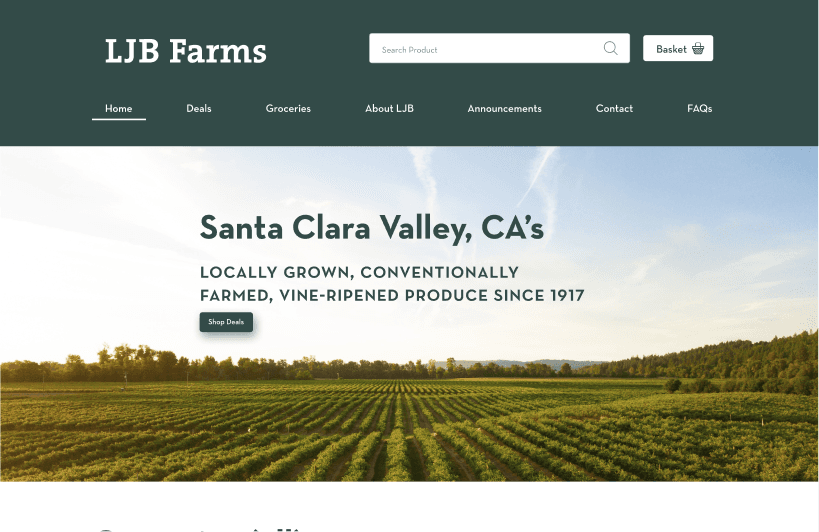
LJB Farms
Design Bootcamp - Coursework Project
E-Commerce Web Design
2023
Role
UX Designer
Platform
Web, Mobile
Tools
Figma, Trello
Duration
2 Weeks
Deliverables
Responsive Mockups
The Challenge
Remodeling information architecture to help grocery shoppers to quickly find produce
Solo-project
Objective
Package its existing data into a more accessible mobile app that makes it easier for people to volunteer, and for volunteers to optimize their efforts.
What I did
I spearheaded the creation of the hi-fidelity mockups to ensure fields are distinct and information is digestible.
How?
I relied on research insights from user interviews and competitive/comparative analysis to guide UI decisions and content hierarchy while maintaining branding guidelines.
Where did we start?
Evaluation
The first thing that I noticed was that the primary call to action was to contact the store itself. This isn't exactly what most customers would be looking for when coming into a grocery stores website.
I looked further to see what types of products they sell, and their e-commerce functionalities were non existent. There was text indicating what types of produce they sell, however, there was little information aside from that. From the design, this information appeared unreliable and i know that they offer much more than their online presence suggests.
Research
User Interviews
To start to understand what people look for in a grocery store and it’s website, I did 6 user interviews with people who regularly do grocery trips.
The line of questions were about: ingredients, places they get ingredients, and bad experiences they’ve had at these places. I did this to get an understanding of what they look for and what the pain points in their overall experience is.
My assumption that most people would care mostly about quality. My assumption was challenged and a later found that I was wrong.
Synthesis
I created affinity map using the user interview notes to create the following insights:
quality/freshness
bang for buck
convenience and time
specific places for specific products
eating healthy
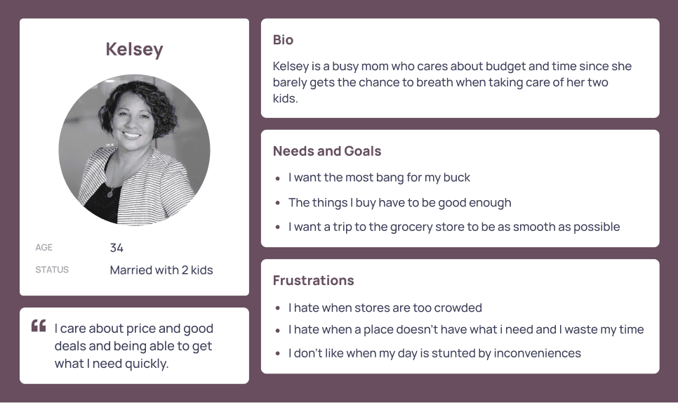
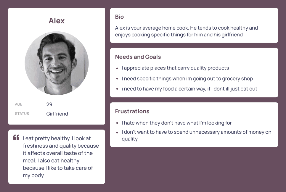
These insights challenged my initial assumptions and allowed me to create the personas of Kelsey and Alex
Personas
Kelsey, the primary persona, embodies the busy body who cares about budget and time. She needs a way to quickly get groceries for a reasonable price because supermarkets can be expensive and crowded
Alex differs from Kelsey in that secondary insights that grocery shoppers tend to like healthy, quality, and specifics.
Alex is a home cook who wants to get specific quality ingredients for his meals because he has to go to multiple different places to get the quality of produce he wants.
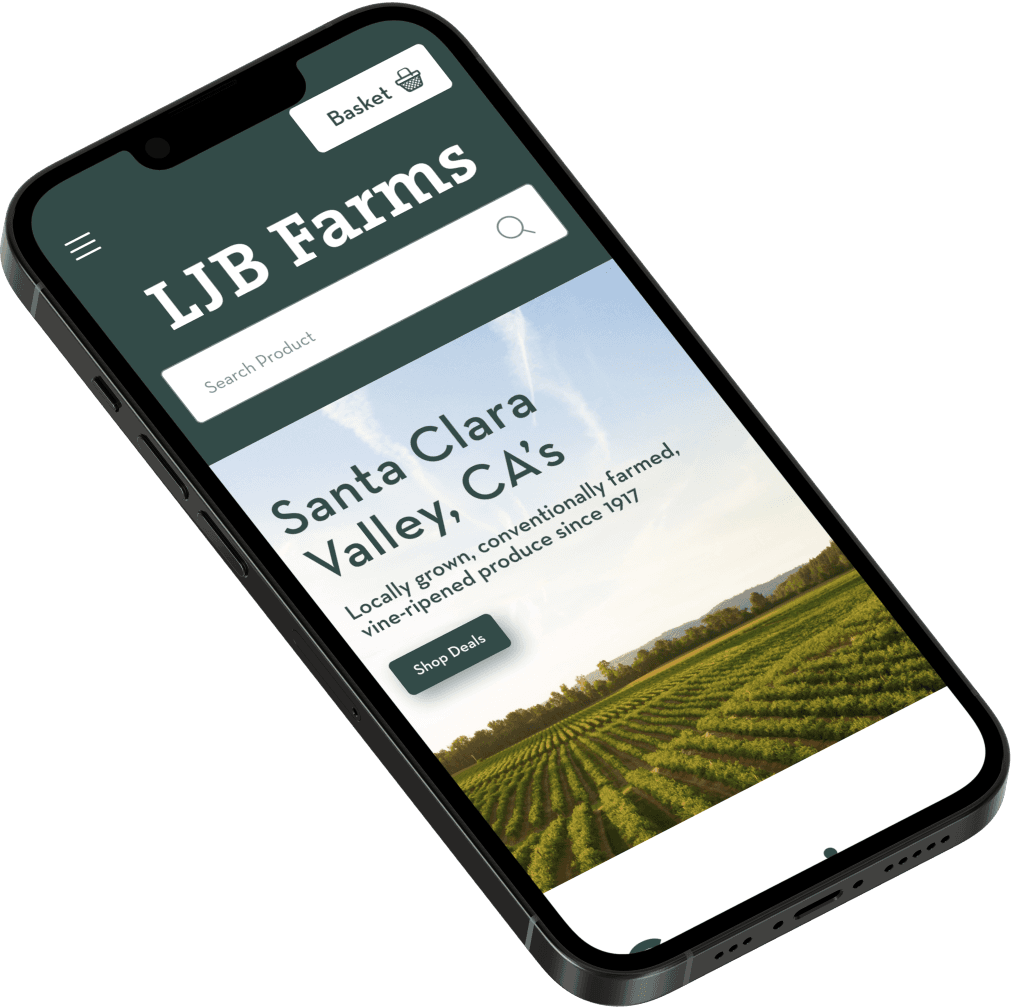
Equipped with this new personas, I created a new LJB Farms website that’s designed to help users quickly find products they’re looking for through improved navigation and showing them LJB offers seasonal produce and deals on the landing page.
Comparative Analysis
Because the page was essentially a redesign, I needed to draw inspiration from existing, successful e-commerce designs like H-Mart and Trader Joes.
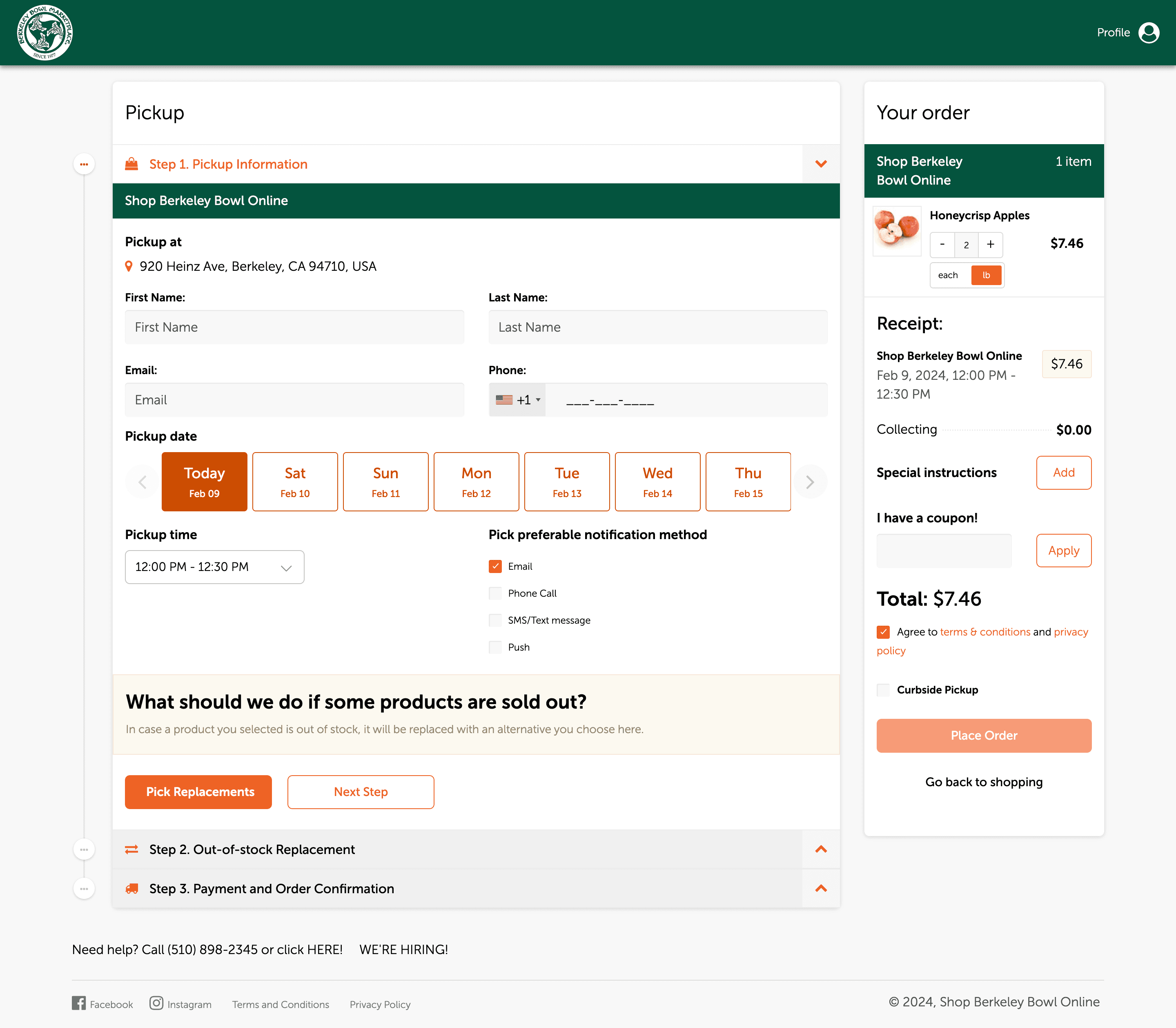
I liked how Berkeley bowl allowed the option to replace items if they’re out of stock and that they used an accordion for the checkout process. I thought it could’ve done without a hover to show the add to cart button
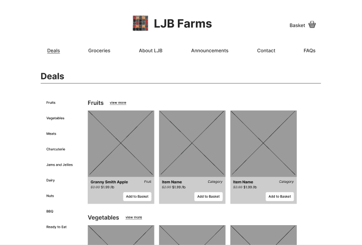
I thought H-Mart did a good job of showing difference in sales price by crossing out the previous price.
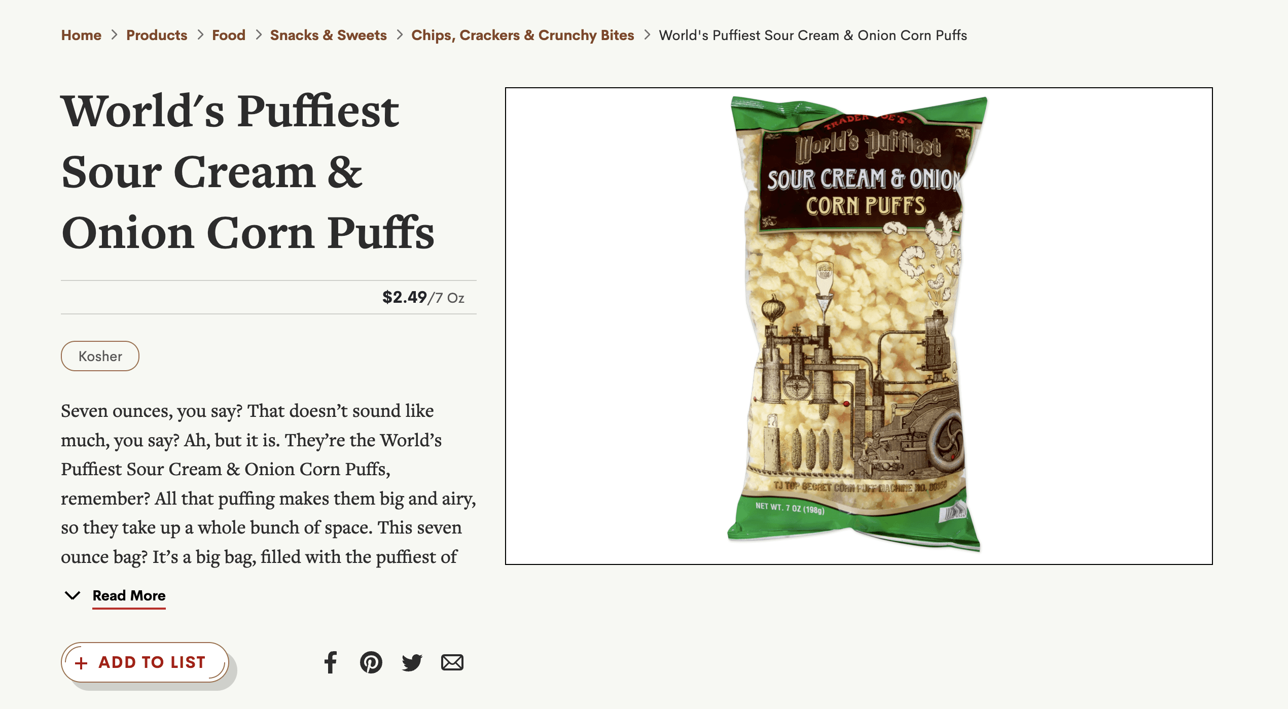
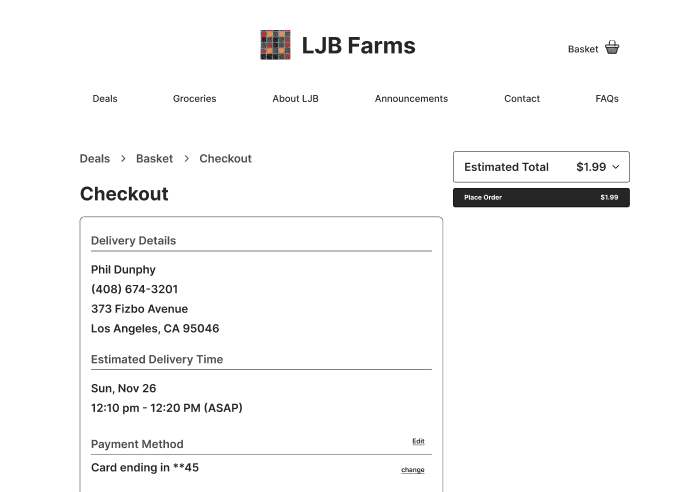
I also liked that trader joes included bread crumbs in the checkout process and maintained excellent branding.
Information Architecture
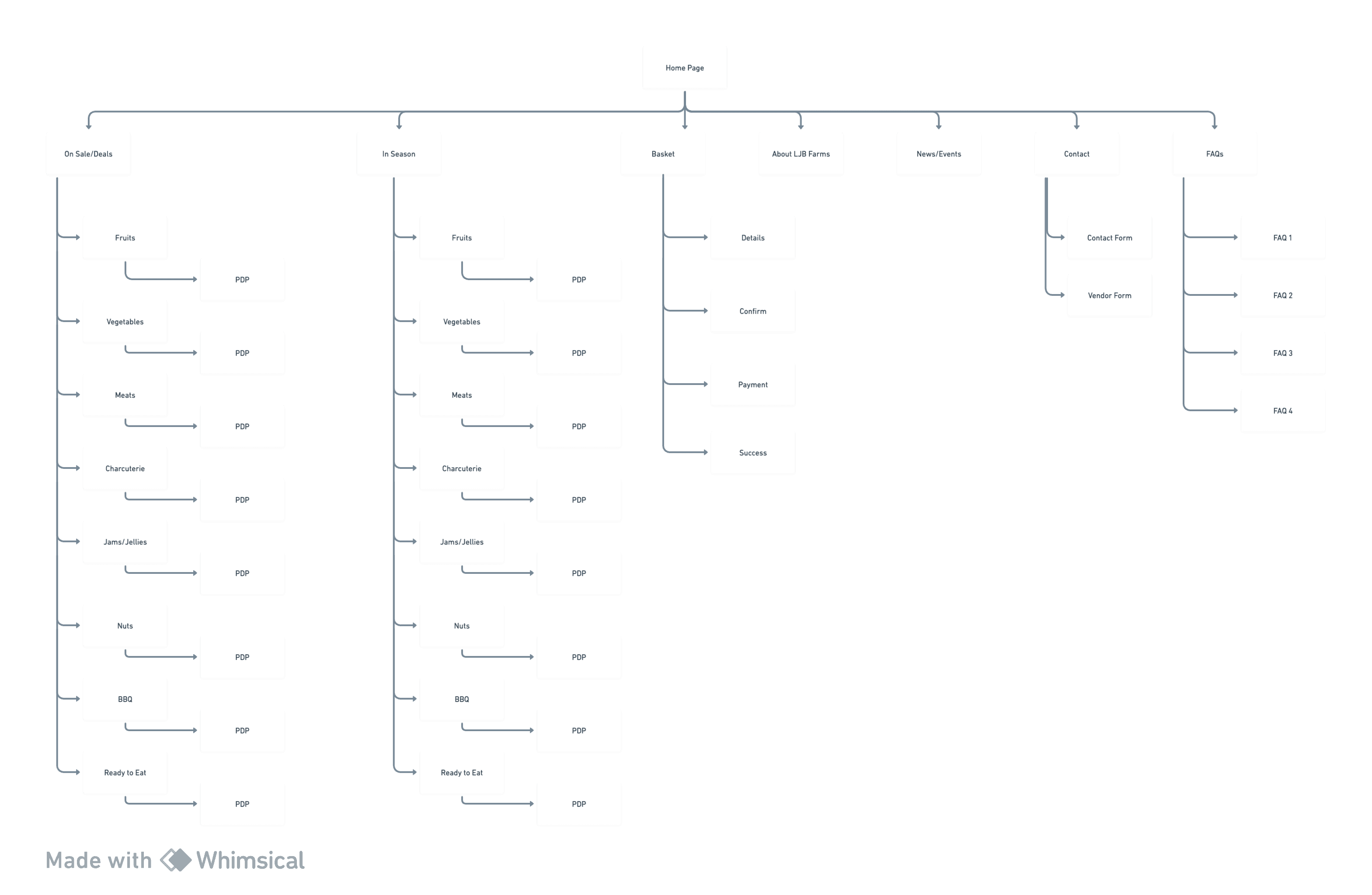
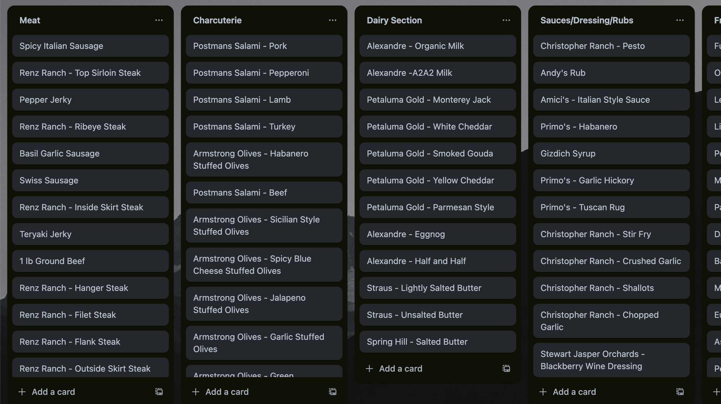
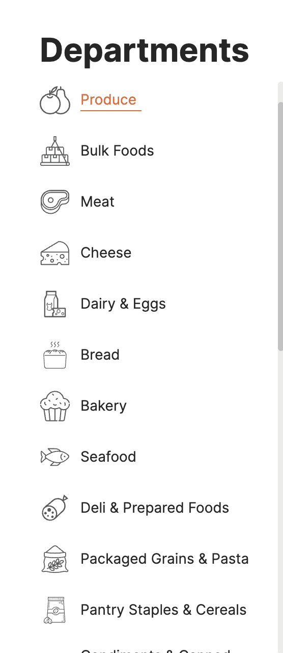
There was a major difference in that LJB provides locally grown produce and products, so I went to the store to take inventory of what types of categories we could use in the sitemap.
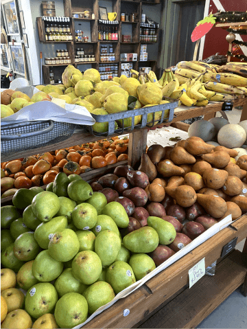
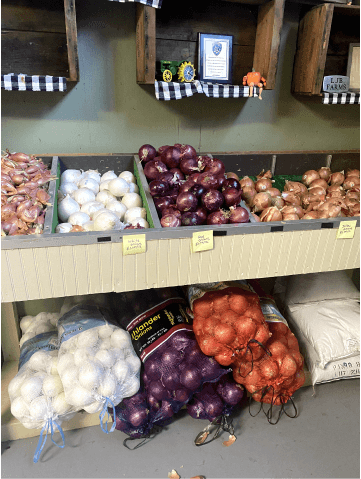
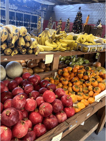
After my visit, created an emphasized tab in the sitemap for deals and in-season produce because bang for their buck is what Kelsey is looking for and in-season produce is what Alex is looking for.
Sitemap
To optimize navigation, I conducted a card sort to see how others would categorize items that LJB keeps in stock
But the primary function of the website is for customers to get what they are looking for. So I fleshed out the checkout task flow for Kelsey and Alex in addition to the produce navigation flow.
Task Flows
With these task flows a sketched some of the main screens to anchor my thought process of what the design should look like.
Sketches
Based on the competitive research, I drew out some sketches using what could be applicable and successful for LJB Farms' website.
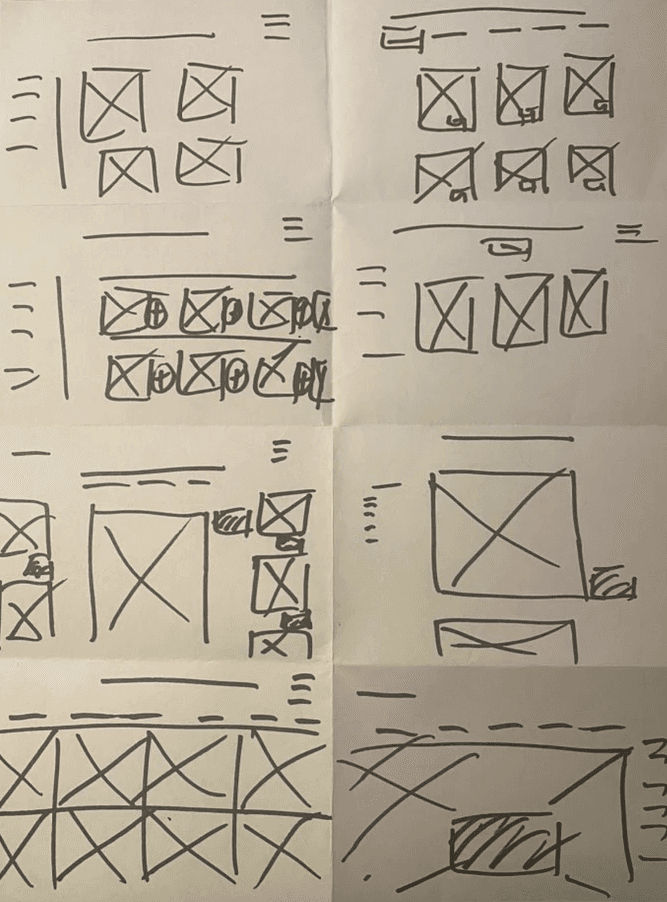
Crazy 8's
I used the inspiration I got from the competitive research and came up with some layouts that made it to wire-framing.
Wireframes
The mid-fidelity wireframes came out more differently than as more research insights were applied.
The jargon like, current deals first and then in-season groceries was emphasized through the design because I feel like the whole brand of LJB is to provide locally grown, in season produce.
I included a breadcrumb layout and all their payment information on one page to prevent confusion for buyers during the checkout process.
Usability Test
Testing that showed that there were no significant flow issues, however,
there were a few bumps with the UX writing, creating uncertainty as to where buttons would take users. I applied these when I shifted gears to bring the wireframes to hi-fidelity.
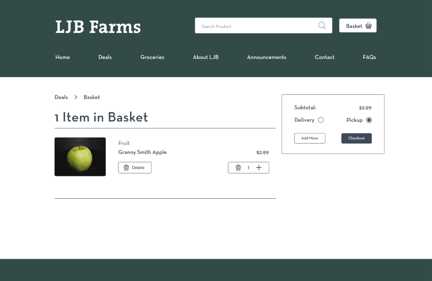
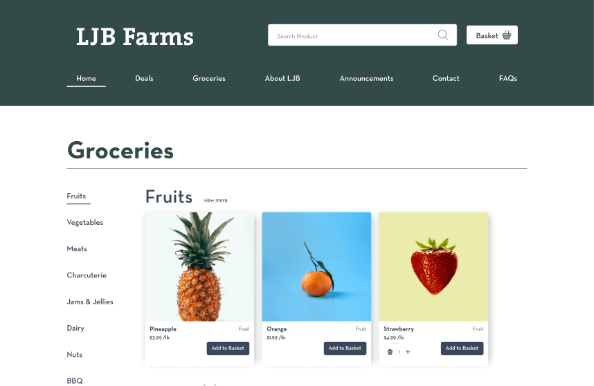
Hi-Fidelity Mockups
The problems coming into hi-fidelity were formatting the designs to be responsive and with color clashing because of the placeholder images of the product cards.
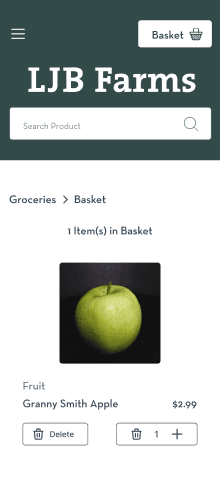
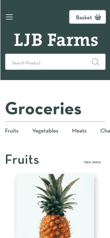
I made the categories a side scroll so that grocery shoppers know where they are in the website.
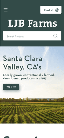
The green gives the home page a more personal vibe for grocery shoppers.
Next Steps
Stakeholder Perspective
I’d like to take a look at how LJB views tracking delivery and pick up orders and updates on stock. Updated stock is what visitors look for according to the research and is even more significant for LJB because they emphasize that they’re produce is in season. As a result, what they have in stock is constantly changing and Alex and Kelsey would like to know when it does.
Thank you for listening!
Next Project
Wind Newspaper
View Project
